Collages for vinyl covers
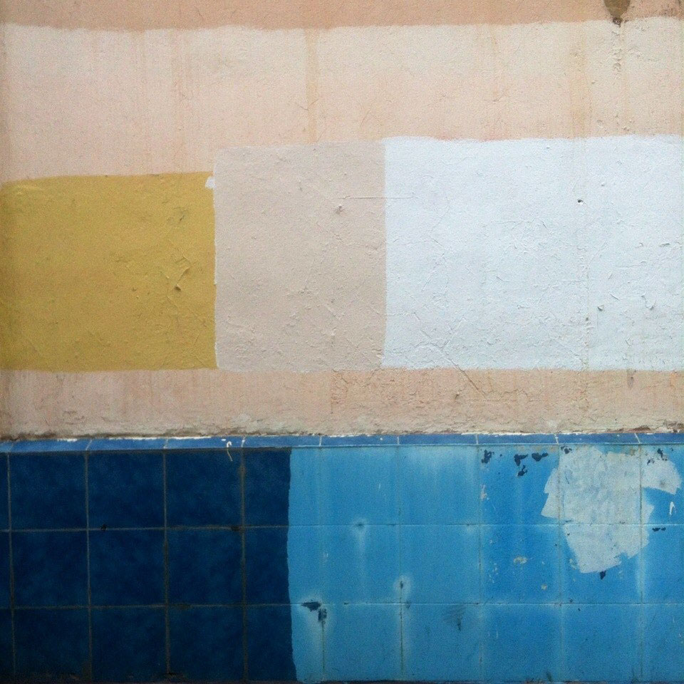
The project idea was born gradually combining different aspects of my hobbies. Last year, I felt an interest in photography of strange stains on walls. This interest began with the fact that municipal painters painted over the tags of my friends with colored squares. Then I realized that in the city I'm not be only one, who photographed these spots and I decided to expand the scope of the series and to search for other squares and geometric shapes in our urban environment. I was inspired by the works of Russian avant-garde artists.
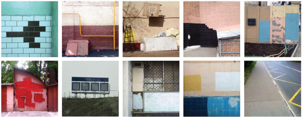
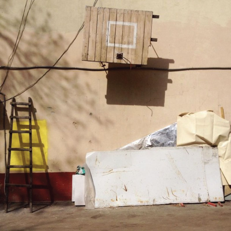
As I often didn't have a professional camera with me, most of the pictures were not such good quality, captured on iPhone. I realized that in this way they do not represent a particular artistic value and decided to redraw them on the computer. I started to get interesting geometric composition. I began to look for the area I would be able to apply the compositions as a design. The solution came by itself, while I was listening to music. I realized that these minimalistic designs are the best associated with the music style of minimal techno. I went to the site of one interesting label - Mobilee and looked over the designs of their records. What I saw did not satisfy me. I realized that my series can be used as designs of vinyl releases of one label and the music from Mobilee records inspires me the most.
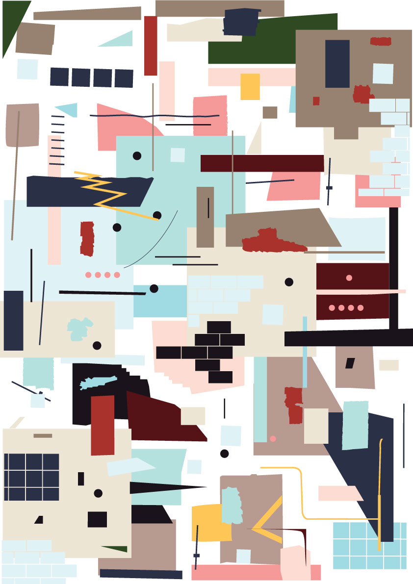
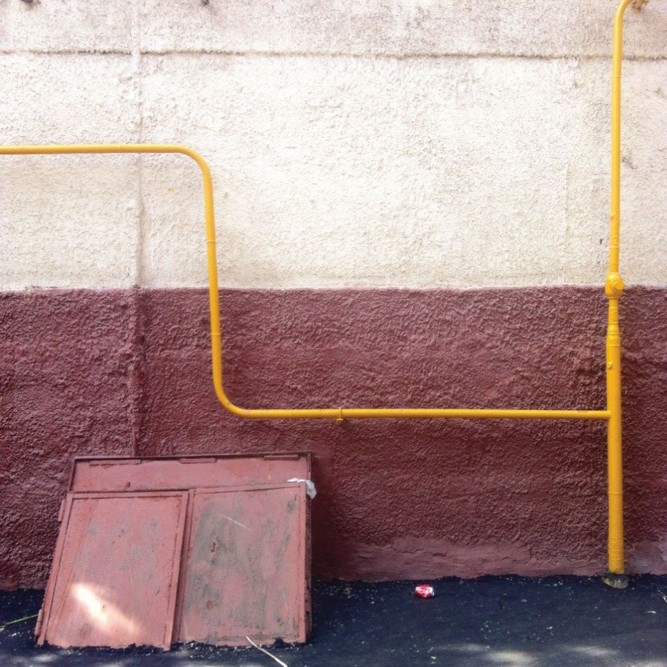
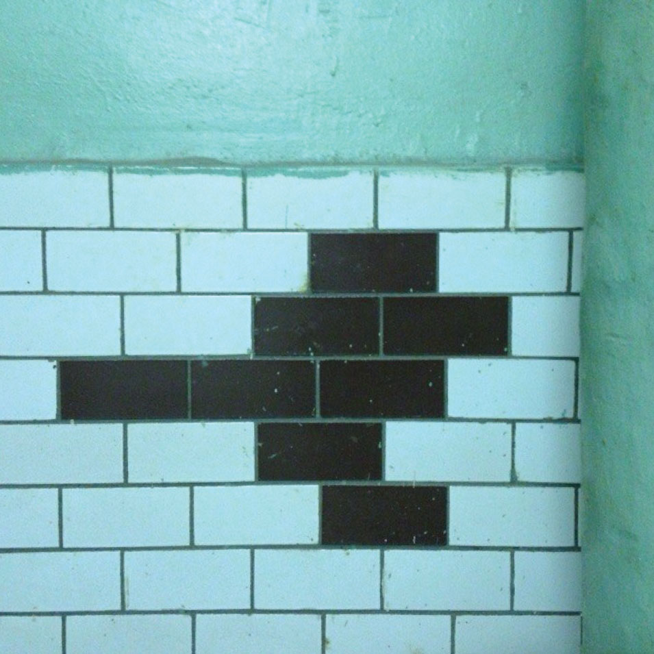
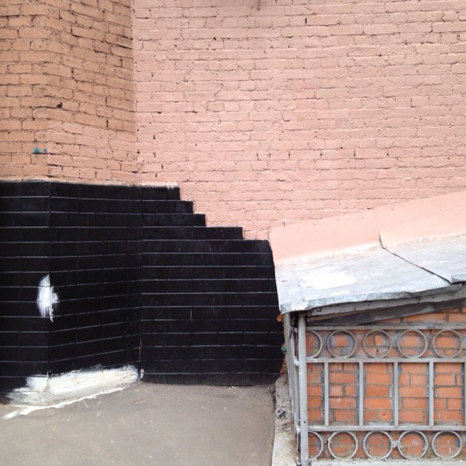
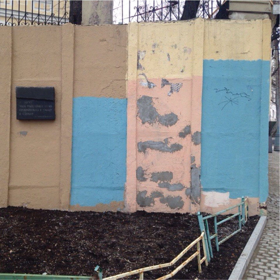
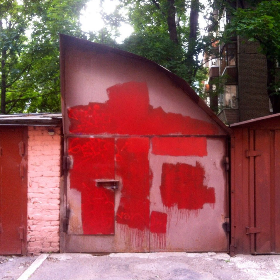
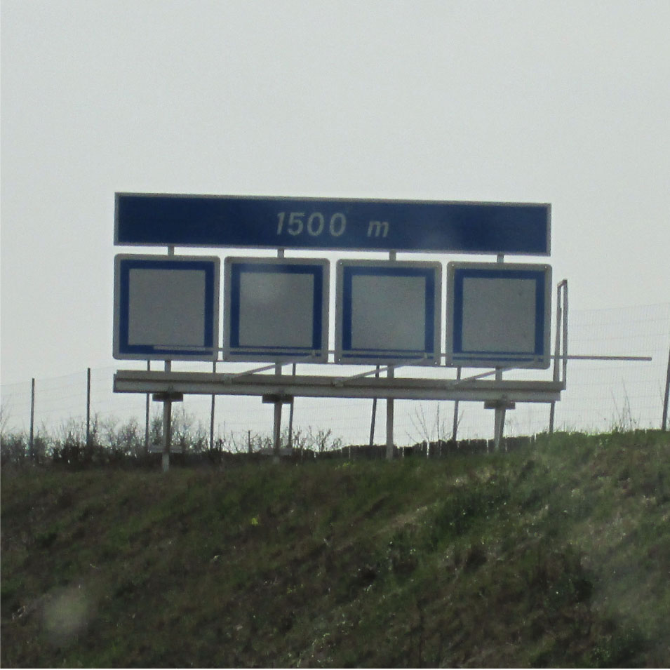
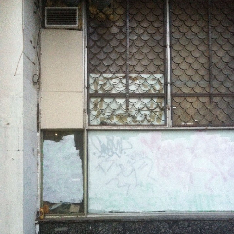
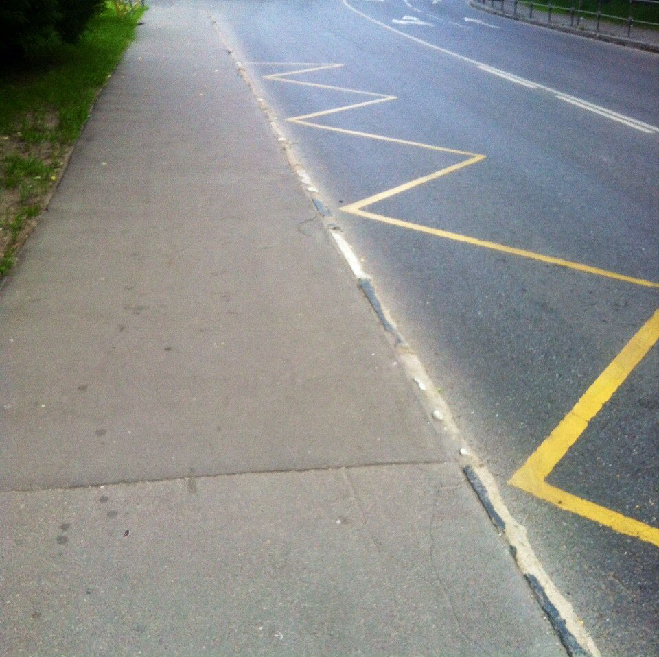
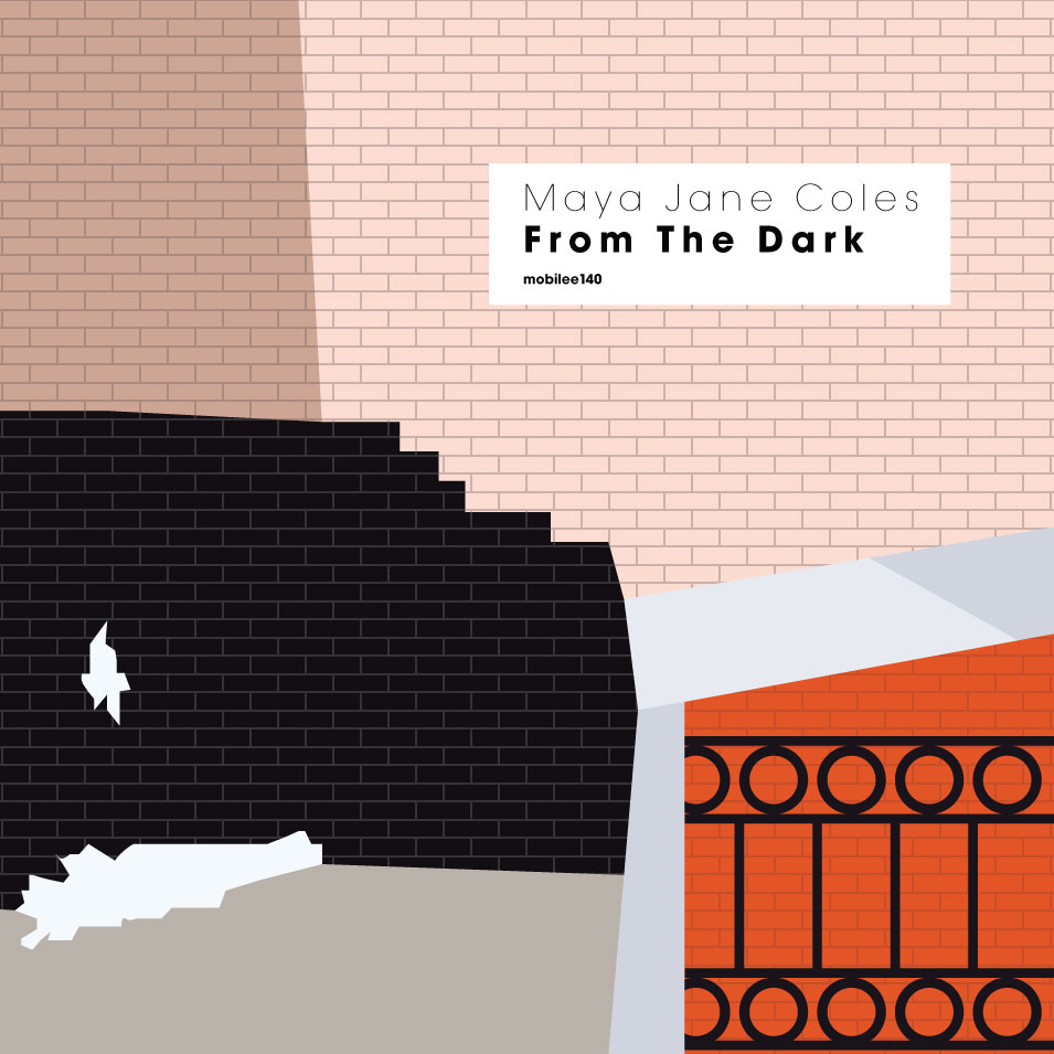
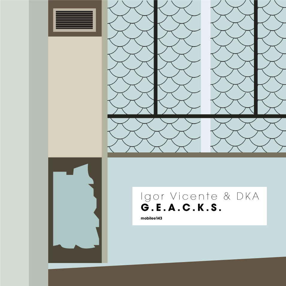
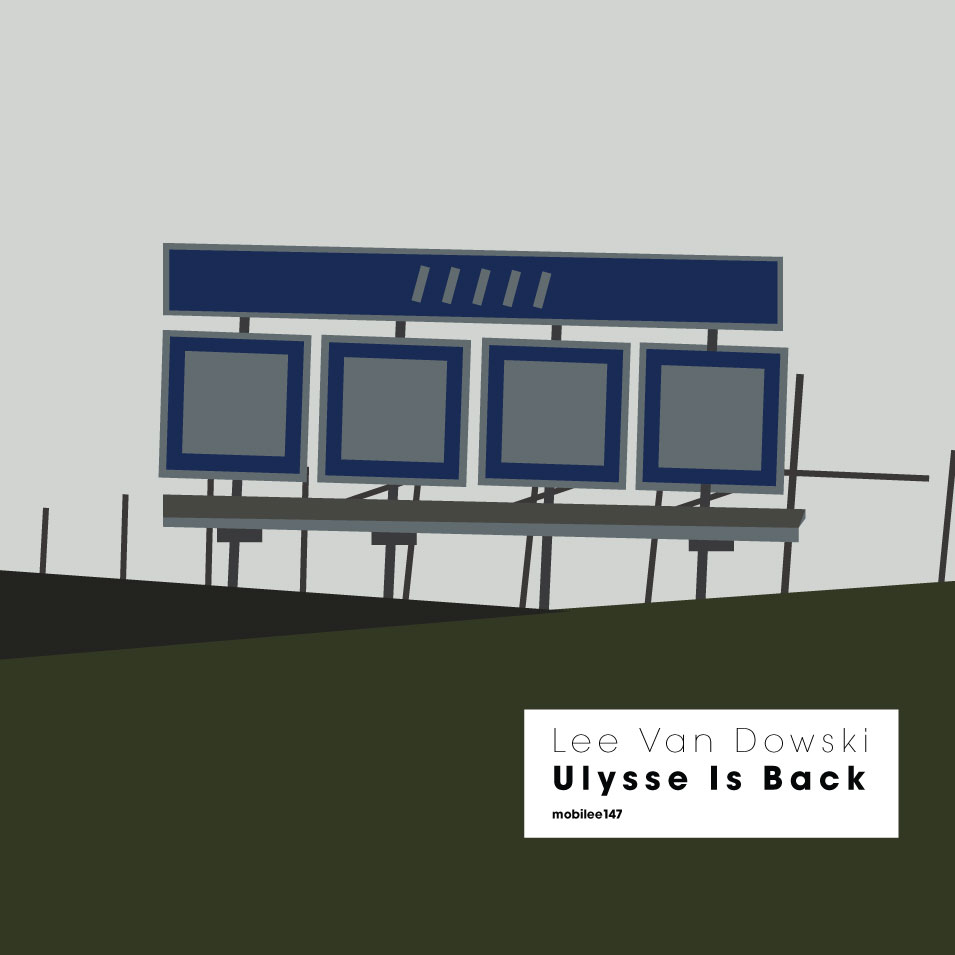
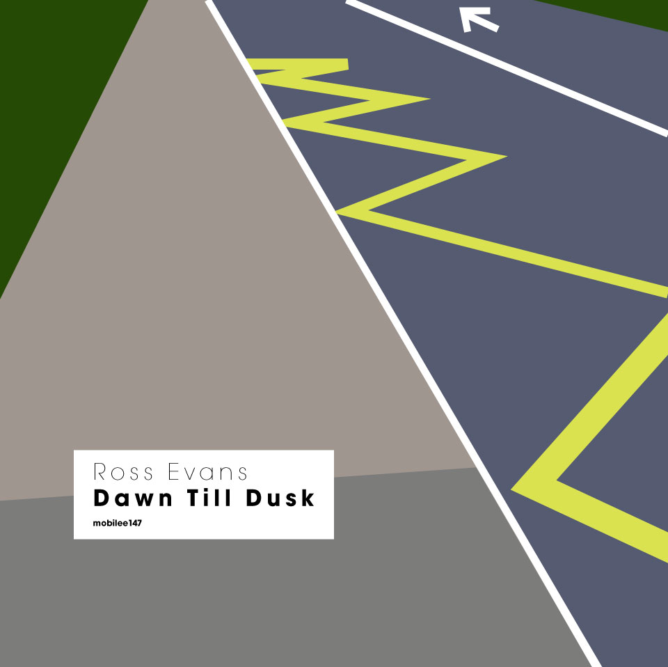
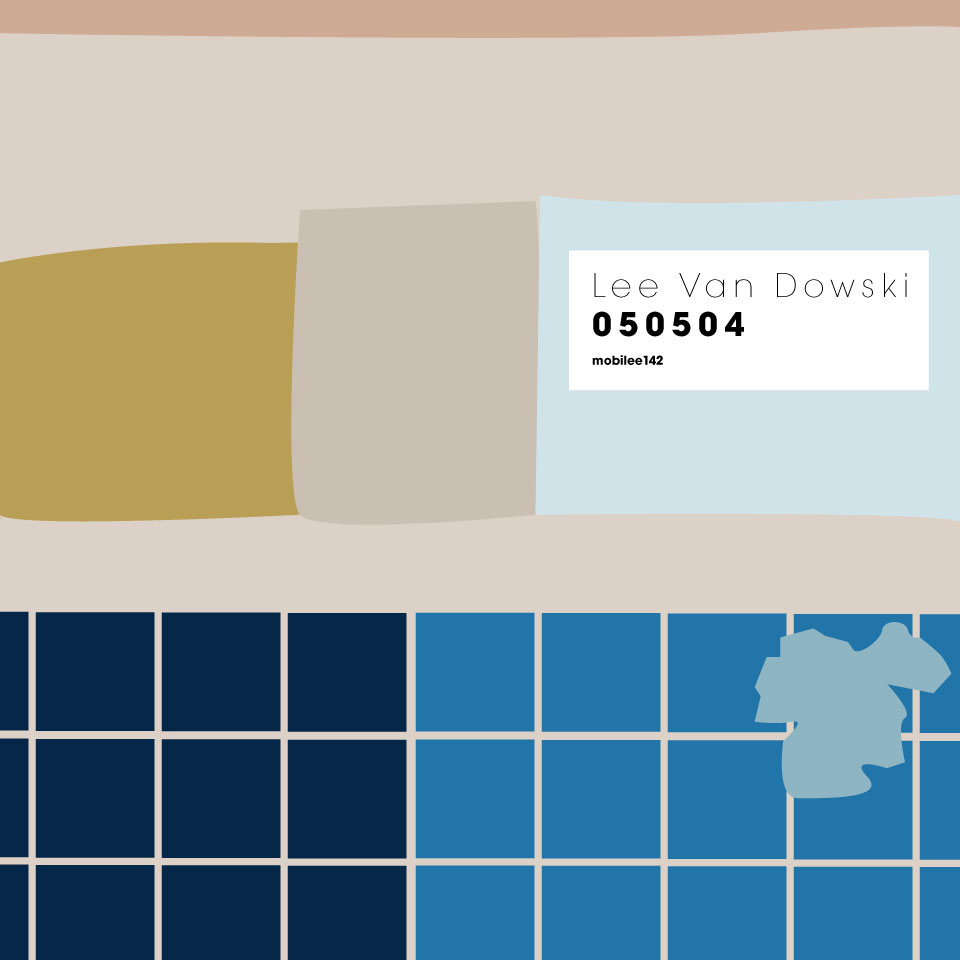
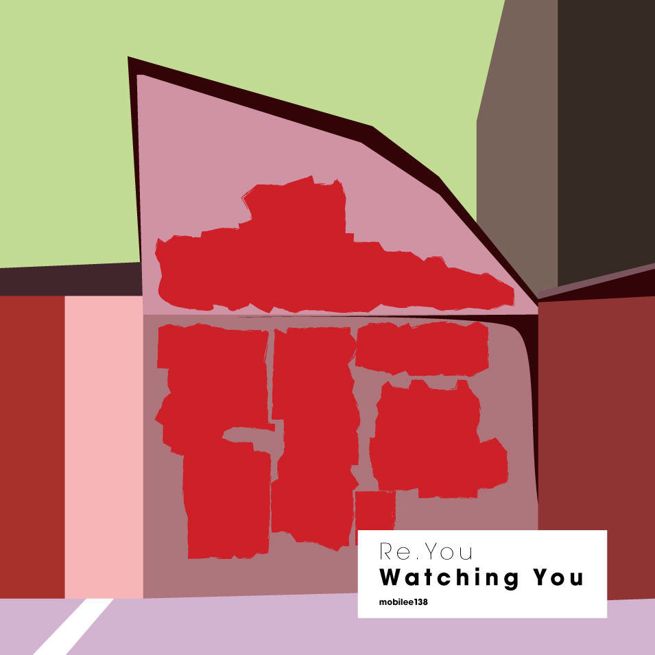
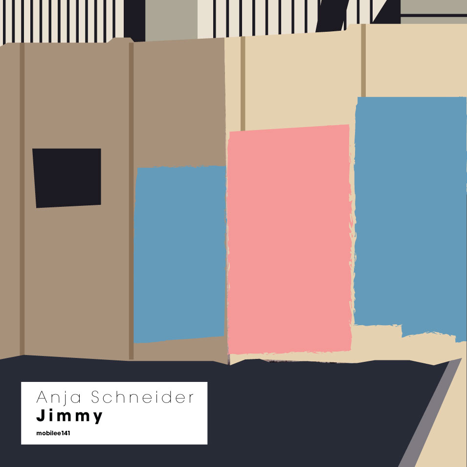

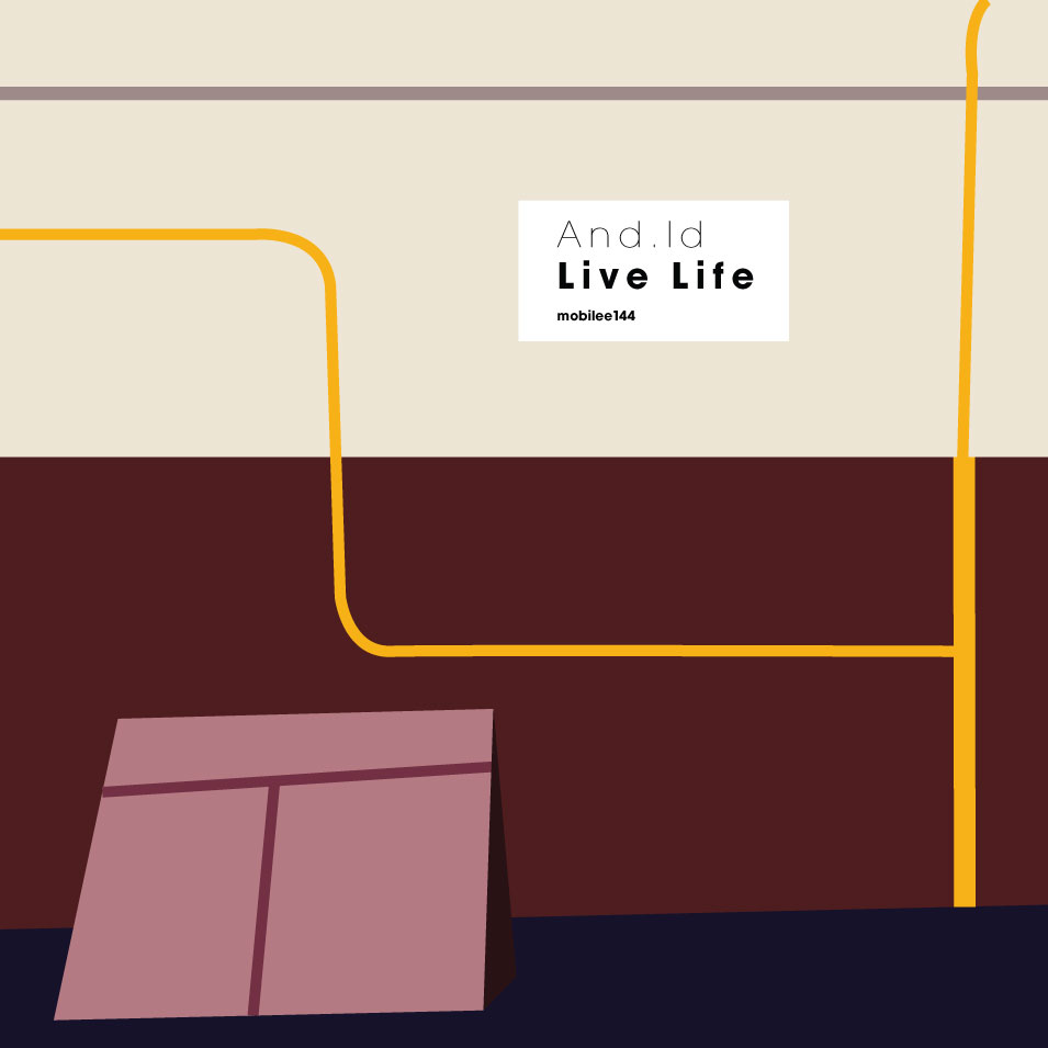
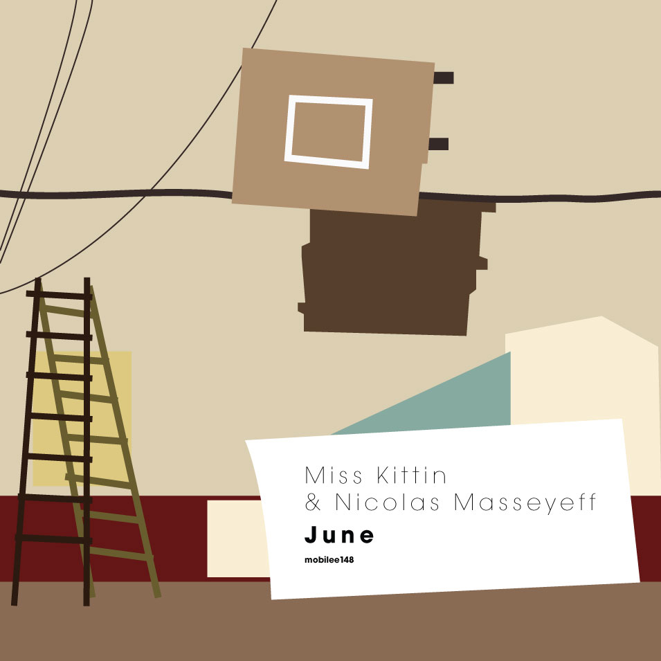
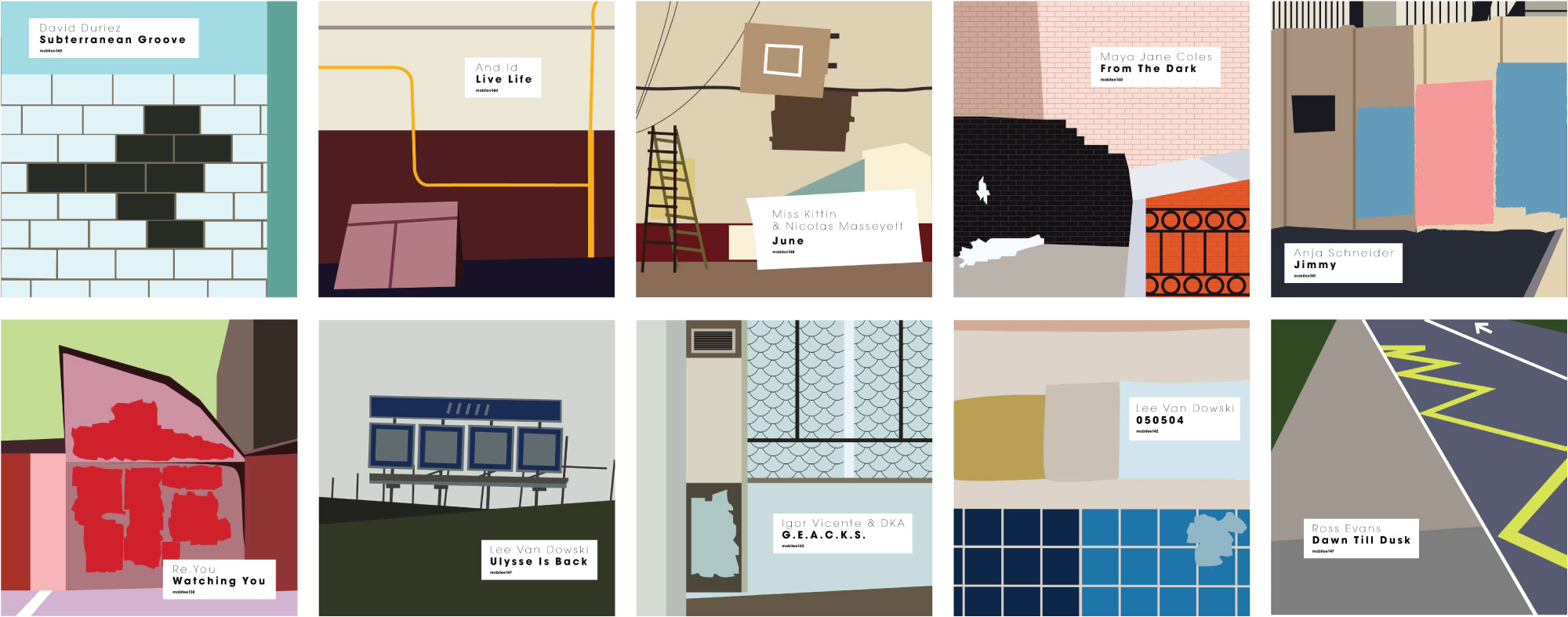
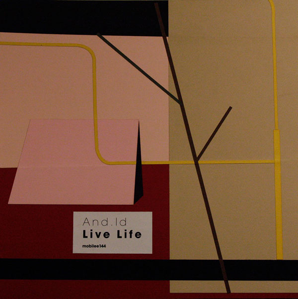
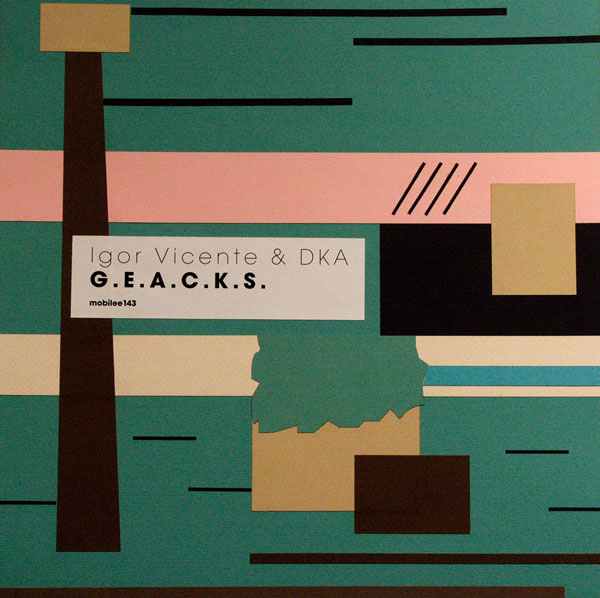
I took the ratio of images and music, created a single unit for the typographic style of the name. Suddenly the thought came that all the objects in my compositions are so geometric that if they were reordered and rotated, you can create countless interesting compositions. I decided to make small clips, where the elements dance to the music compositions. For this I cut each composition with color paper. I created new compositions and took photos of it. Sometimes the newly developed compositions pleased me more than the originals, that came from the photos.
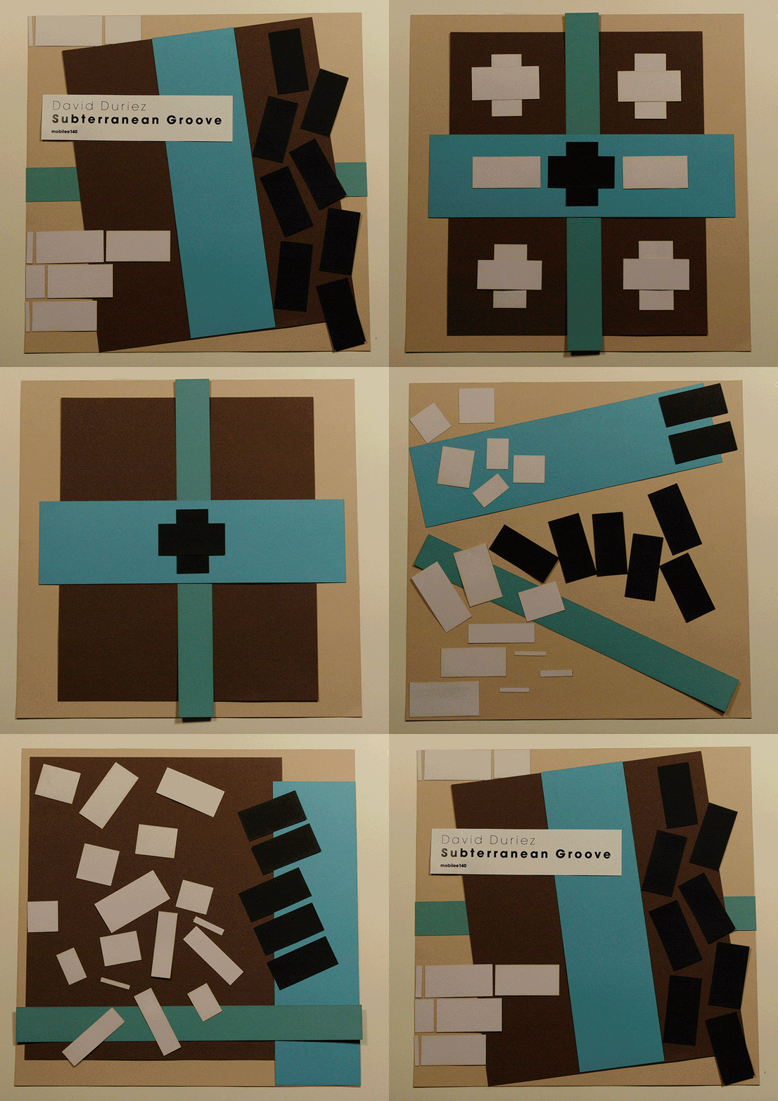
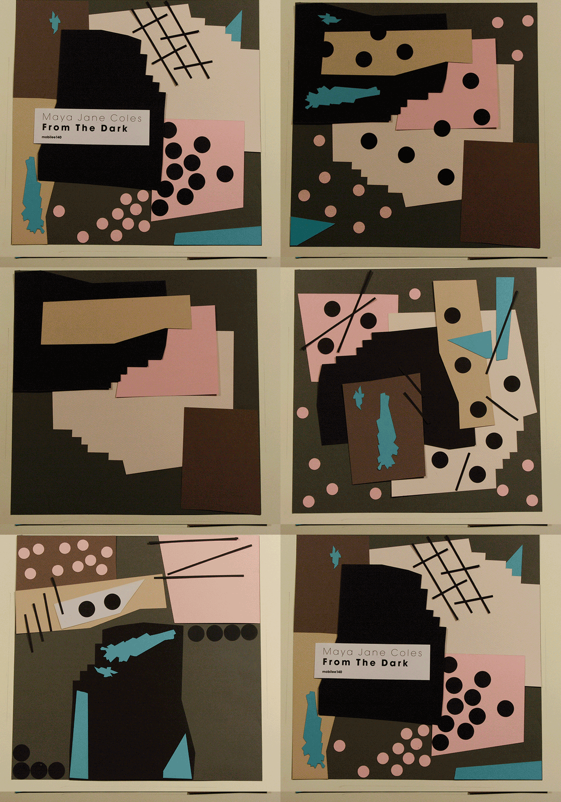
In the end, I cut parts with a laser, so I optimized the number of colors (paper sheets), causing some colors in the pictures to distorted. But the whole series in overlap in color.
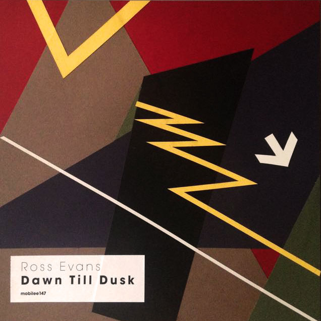
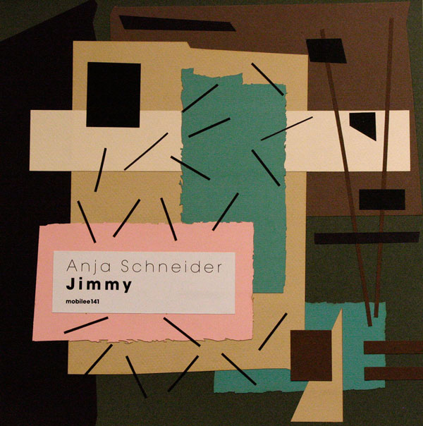
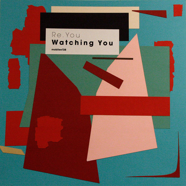
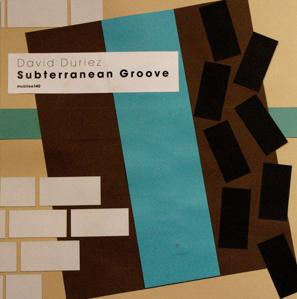
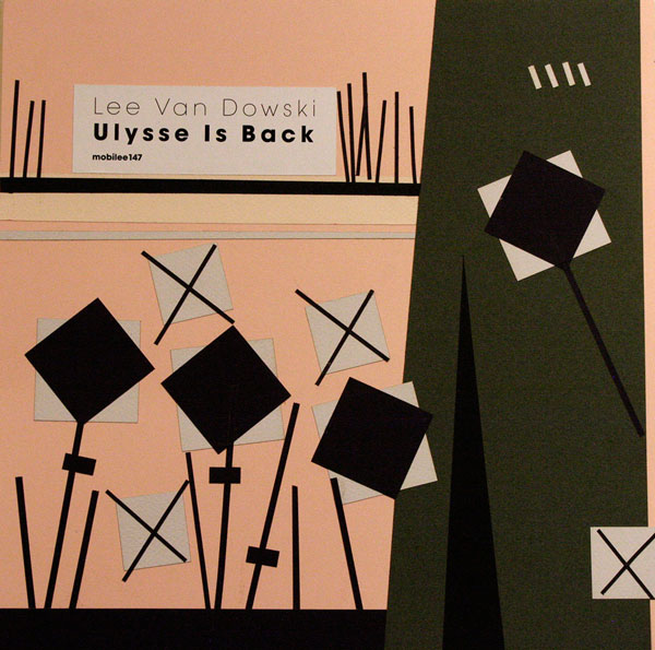
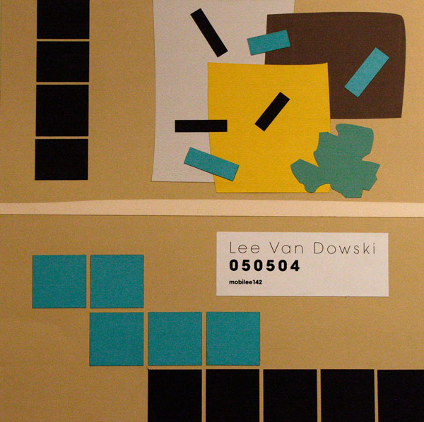

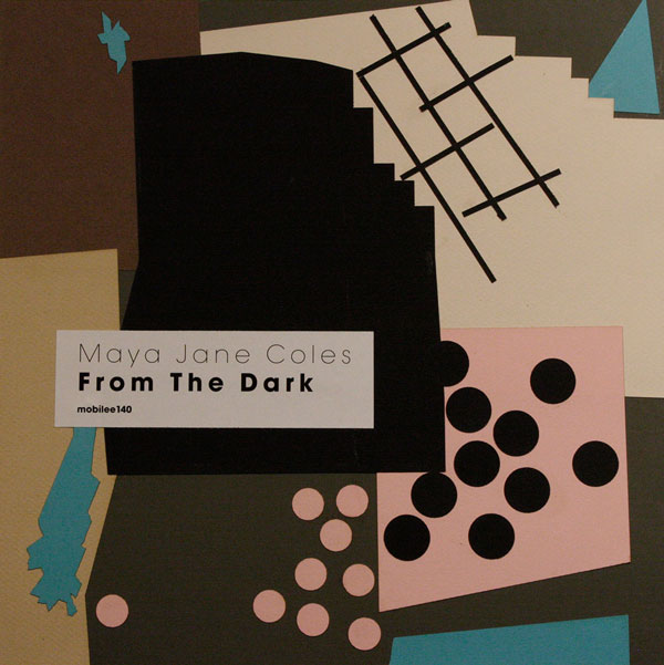
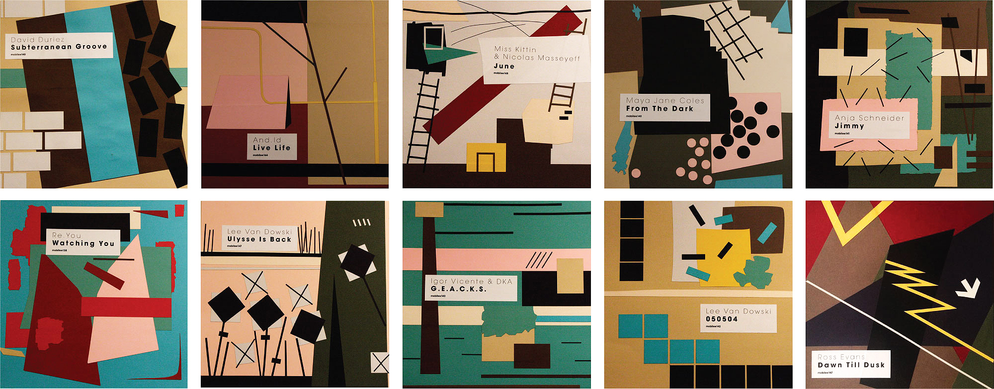
In preparation for laser cutting I have formed files with the details laid out by
color from all 10 compositions. These files I overlapped, slightly corrected and received a stylish ornament, which I printed on a T-shirt. I think it also could be an interesting fabric for the shirt.
